Typeco created this font for Hamilton in conjunction with P22 type foundry. See our older post about the making of HWT Geometric.
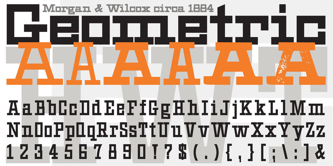
HWT Geometric now available at Hamilton Wood Type Foundry. This late 19th century design conjures up early 20th century Dutch DeStijl lettering with a mostly strict adherence to right angles and minimal stroke modulation. Geometric began its life as a metal typeface from the Central Type Foundry, circa 1884. Soon after, this design was officially licensed to Morgan & Wilcox and was shown in their 1890 catalog in Regular, Light and Condensed Light variations. After acquiring Morgan & Wilcox, Hamilton Manufacturing offered Geometric Light Face Condensed as their own No 3020 and the Geometric Light Face as No 3021. HWT Geometric has been expanded digitally to include a Regular Condensed version. A heavier wood type specimen was found from an unknown manufacturer and digitized as it was found, resulting in the HWT Geometric Shopworn and Shopworn Inked variations.
Typeco created this font for Hamilton in conjunction with P22 type foundry. See our older post about the making of HWT Geometric.
0 Comments
Sarina makes 7 fonts on Google Web Fonts from Typeco. This one was sparked by several letters from an old sports car nameplate. Through development it took on the look of a sign painter's brush script. By the way, all of these fonts on Google are Open Source, so you can use them freely on your websites or download them for print use.
Metamorphous is Typeco's 6th font for Google web Fonts. Once again we consciously engineered this font to read well at small sizes on the screen, while infusing a ton of character evident at larger sizes. This serif face borrows liberally from lettering styles of the past while infusing a bit of fantasy.
Supermercado makes it my 5th font released on Google Web Fonts. Supermercado is a fun rounded sans condensed, with swash caps. Keeping web display in mind, we designed it to work surprisingly well at fairly small sizes, while it is certainly quite distinctive when set at larges sizes.
Atomic Age font released on Google Web Fonts. It was inspired by 1950s era connected scripts seen on nameplates of cars and home appliances. In the interest of making it usable on the web at small sizes, it looses the connections but keeps the spirit of these letters to make a highly legible screen font with flair.
Short Stack will be Typeco's 3rd font on Google Web Fonts, released through Sorkin Type. It's a Comic San-ish kinda thing, keeping in mind display on the web. Short Stack is sturdy, and clear but also whimsical and fun.
Black Ops is my second font on Google Web Fonts. My first font released in conjunction with Sorkin Type. Big thanks to Eben Sorkin for all his help.
Black Ops is a low contrast semi geometric typeface inspired by military stencil lettering. Black Ops is heavy, sturdy, and punchy. Reminiscent of my Super Duty, but way more humanist and useful. |
WhoTYPECO is the digital type foundry for the designs of James Grieshaber. Typeco puts a modern spin on familiar concepts to create bold and versatile font families. Relevant type styles with a significant nod to the past. Typefaces
Reenie Beanie™
1 FONT Zaftig®™ Pro
1 FONT Super Duty™
25 FONTS Trapper™
8 FONTS Archives
June 2013
Categories
All
|