Typeco created this font for Hamilton in conjunction with P22 type foundry. See our older post about the making of HWT Geometric.
|
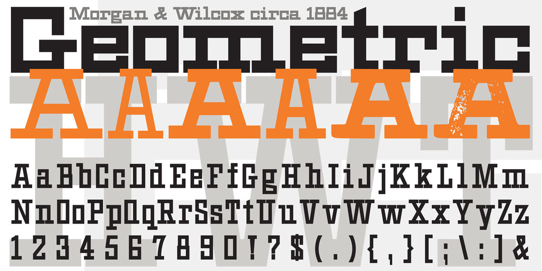
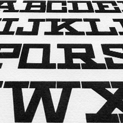
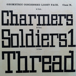
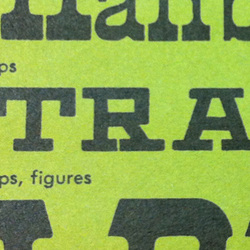
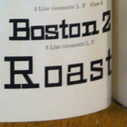
HWT Geometric now available at Hamilton Wood Type Foundry. This late 19th century design conjures up early 20th century Dutch DeStijl lettering with a mostly strict adherence to right angles and minimal stroke modulation. Geometric began its life as a metal typeface from the Central Type Foundry, circa 1884. Soon after, this design was officially licensed to Morgan & Wilcox and was shown in their 1890 catalog in Regular, Light and Condensed Light variations. After acquiring Morgan & Wilcox, Hamilton Manufacturing offered Geometric Light Face Condensed as their own No 3020 and the Geometric Light Face as No 3021. HWT Geometric has been expanded digitally to include a Regular Condensed version. A heavier wood type specimen was found from an unknown manufacturer and digitized as it was found, resulting in the HWT Geometric Shopworn and Shopworn Inked variations.
Typeco created this font for Hamilton in conjunction with P22 type foundry. See our older post about the making of HWT Geometric.
0 Comments
A curious wood type indeed. This type, known as Geometric, was originally introduced previous to 1884 by the Central Type Foundry. Hamilton Manufacturing eventually acquired this design and rereleased it with more weights and widths. But Geometric strangely has qualities of the De Stijl artistic movement. It reminiscent of the alphabets of Theo van Doesberg, drawn almost 30 years later. Who knows, perhaps Theo was inspired by these minimal letters. Working with as much source material as we could find, we pieced together 6 fonts. We replicated pristine versions of the 4 fonts we knew existed. Then I created 2 Shopworn versions, showing a more rough and warm cut of this face that tries to replicate some of the artifacts of hand-cut wood and the attrition of well used wooden type. Of course I expanded on it to include all the sorts and Central European diacritics you might need. This project is in the works and slated for a June release from Hamilton Wood Type Foundry. For making HWT Geometric possible I have to give big thanks to Richard Kegler at P22 type foundry, Bill & Jim Moran at the Hamilton Wood Type Museum, and David Shields the foremost American Wood Type historian. Font Aid VI: Aster Affects is a collaborative typeface for Hurricane Sandy relief.
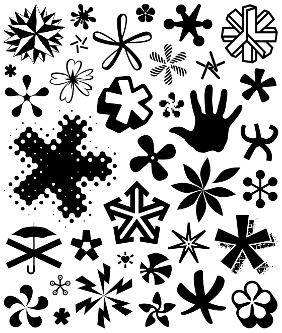
In October 2012, Hurricane Sandy struck portions of the Caribbean, mid-Atlantic, and northeastern United States with a vengeance. Sandy was the largest Atlantic “superstorm” on record and is currently ranked as the second costliest Atlantic hurricane, surpassed only by Hurricane Katrina in 2005. In response, the Society of Typographic Aficionados organized Font Aid VI: Aster Affects — a project uniting the typographic and design communities to raise funds for Red Cross relief efforts after the events of Hurricane Sandy. The project theme was represented in a typeface consisting entirely of asterisks and other star-inspired symbols. Over 250 designers from 41 countries contributed glyphs to the project. Typeco's own James Grieshaber has contributed an illustrative asterisk to the support this project. If you would like to support this relief effort, the Font Aid VI: Aster Affects font may be purchased for $20US through the SOTA Store. James Grieshaber of Typeco is a last minute addition to the instructors for Crafting Type's 3-day workshop in Chicago. Crafting Type are concentrated workshops that teach absolute beginners how to create a typeface. Students are ushered through the entire type design process: from sketching secrets to digital drawing techniques to OpenType coding and more.
A team of professional type designers reveals the secrets to crafting typefaces with an approach to teaching that is hands-on, encouraging, interactive—and fun! CT provides all of the necessary software, plus hundreds of fonts to study and play with. No previous experience of type design is required. Students leave with (in addition to some fond memories) new typography skills, new tools for drawing type, and the first key letters of your own type design. There is still time to register, or look out for future workshop in a city near you. Once again Typeco sponsors TypeCon. TypeCon is an annual conference presented by the non-profit Society of Typographic Aficionados (SOTA), an international organization dedicated to the promotion, study, and support of typography and related arts. It is a fun and informative week for those interested in art and craft of typography.
Sarina makes 7 fonts on Google Web Fonts from Typeco. This one was sparked by several letters from an old sports car nameplate. Through development it took on the look of a sign painter's brush script. By the way, all of these fonts on Google are Open Source, so you can use them freely on your websites or download them for print use.
Metamorphous is Typeco's 6th font for Google web Fonts. Once again we consciously engineered this font to read well at small sizes on the screen, while infusing a ton of character evident at larger sizes. This serif face borrows liberally from lettering styles of the past while infusing a bit of fantasy.
Supermercado makes it my 5th font released on Google Web Fonts. Supermercado is a fun rounded sans condensed, with swash caps. Keeping web display in mind, we designed it to work surprisingly well at fairly small sizes, while it is certainly quite distinctive when set at larges sizes.
Atomic Age font released on Google Web Fonts. It was inspired by 1950s era connected scripts seen on nameplates of cars and home appliances. In the interest of making it usable on the web at small sizes, it looses the connections but keeps the spirit of these letters to make a highly legible screen font with flair.
Short Stack will be Typeco's 3rd font on Google Web Fonts, released through Sorkin Type. It's a Comic San-ish kinda thing, keeping in mind display on the web. Short Stack is sturdy, and clear but also whimsical and fun.
|
WhoTYPECO is the digital type foundry for the designs of James Grieshaber. Typeco puts a modern spin on familiar concepts to create bold and versatile font families. Relevant type styles with a significant nod to the past. Typefaces
Reenie Beanie™
1 FONT Zaftig®™ Pro
1 FONT Super Duty™
25 FONTS Trapper™
8 FONTS Archives
June 2013
Categories
All
|



 RSS Feed